Friday, November 18, 2011

Low-doc loans “a concern” to ASIC

image But apparently not to the AOFM.

The AFR today includes a piece relating to ASIC’s first review of mortgage brokers’ compliance with new responsible lending rules.

It’s stated that low-doc loans represent the area of greatest concern to the corporate regulator, which is why it makes it all the more puzzling that another arm of government, the Australian Office of Financial Management, is happy to buy these things as part of its RMBS support arrangements. Low-doc loans were certainly on their shopping list in 2010 (see Low-doc loans? Ship ‘em in!).  Is this still the case? If so, why?

Wednesday, November 16, 2011

Deutsche Bank – settling for second

More financial institution climbing inspired silliness on the front page of today’s AFR:

New Picture

I know parallax can do some strange things, but that “peak” that the brave men and/or women of Deutsche Bank have just scaled (a feat apparently accomplished by putting their clients first) is clearly lower than the one just a couple of hundred metres away.  Quitters!

As for the fine print, it reads “This advertisement has been approved and/or communicated by Deutsche Bank AG and appears as a matter of record only.”

Care factor?  A matter of record? What are they babbling about?

Speaking of babbling, there’s more weird banking/climbing stuff here and here.

Friday, November 11, 2011

EU Leaders

Given the financial catastrophes engulfing their countries, it’s interesting to note what their leaders are focussing on:

image

Tuesday, October 18, 2011

Occupy Wall St. – that’s telling them

Almost as catchy as “hell no, we won’t go!”

image

image

          image

Thursday, October 13, 2011

ASX goes rock climbing

image[5] Following the trend of financial services firms using “inspirational” climbing themes to promote their wares (e.g. here) , the ASX has now inexplicably added this graphic to the front page of their website at asx.com.au. Clicking “find out more” provides some further info about exchange traded options, but has no further clues about why the ASX would promote them with climbing imagery.

The photo raises a couple of interesting points:

1. What exactly is the bloke doing?

2. What relevance does it have to exchange traded equity options?

Taking the points in order, it’s very difficult to say what the hell he’s up to.  The double tie-in points – one much higher than his harness, one much lower, suggests that he’s sitting in some kind of belaying seat.  The role played by the second rope, to which he’s clinging grimly, is unclear.  Actually the whole thing’s unclear, which brings me to my second point – what has this to do with equity options?  The only possible thing I can think of is that the climber is engaged in some kind of elaborate self-rescue scenario, thereby having a tenuous link to the use of options to hedge physical positions.

In any event, it’s rubbish.

On which subject this highly motivational poster recently came to my attention:

image

Ignoring the general confusion surrounding the text (what on earth are they driving at?) I particularly like way they’ve photoshopped the rope out of the picture, but left the harness in.  Or am I missing something…is this some kind weird deep water solo set up?  If I ever meet a deep water soloist I’ll remember to ask. 

Carbon tax and the voice of reason

image Amidst all the foot-stamping and mouth-frothing that’s surrounding the supposed “debate” on the carbon tax, it’s nice to see that some of our commentariat are able to keep things in perspective: refer Peter Martin this morning.

Monday, September 26, 2011

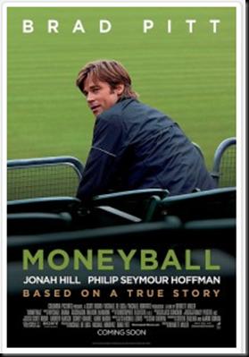
Moneyball – the movie

image

Michael Lewis has written a series of excellent books, starting with Liar’s Poker, which lifted the lid on the investment banking game in general and Salomon Brothers in particular.  His book Moneyball was a fascinating study of baseball and business, and has been turned into a movie starring Brad Pitt (which seems a bit unlikely) in the role of Billy Beene, the Oakland A’s GM.

Excellent reviews over at Rotten Tomatoes (currently 94%).  Trailer link is below.


Tuesday, September 20, 2011

RBA says…you’re wrong Bill!

From the minutes of the September RBA Board meeting:

Members were informed that, in Australia, market pricing prima facie pointed to expectations of large cuts in the cash rate by the end of the year, but a range of technical factors meant that market pricing might not be giving an accurate reading of expectations in the current circumstances.

This loosely translates as: Bill Evans, you’re wrong!

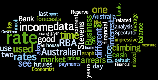
And speaking of Bill, it’s nice to see that he’s snuck into my Wordle word cloud:

image

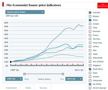
The Economist Global House Price App

image

Check out this brilliant global house price charting app from The EconomistIt’s got a bunch of indicators including raw house prices, real house prices, house price to income and price to rent ratios, and others.  Impressive!

What’s also impressive are some of the results.  No real surprise in some of them, like the spectacular price collapse in Ireland and elsewhere, but what I didn’t anticipate at all was the strength of the market in South Africa:


image

More than 550% growth since 1997 seems a bit too good to be true, and is, in a word, spruikalicious.


And here’s another great tool on the Economist site:


image

This thing tracks reader comments by topic, frequency and relationships with related topics.  Fantastic for tracking what issues have got the online crazies arced up at any point in time.

Thursday, September 15, 2011

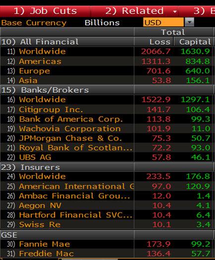
GFC Losses

While exploring the wonders of Bloomberg I came across this neat summary of total GFC related write-offs.  A lazy US$2 trillion, and a great time to be bracketed with “Asia”.

image

Wednesday, September 7, 2011

Share Investing and Sport Climbing

Financial services firms seem to have a penchant for using climbing related themes to advertise themselves, often with laughable results (check here and here for some examples).  Today it was the turn of that mighty organ, the Australian Financial Review, to have a go, using climbing themes extensively in a supplement entitled “Share Investing – the Complete Guide”.  Putting aside the obvious problems of classifying a 26 page pamphlet as a “complete guide”, the climbing imagery is as follows:


An impressive start – this girl looks the goods, from the nose stud to the chalked fingers to the slight sense of disarray amongst her quick draws.

The right foot “sur la pointe” move is interesting, but she wouldn’t be the first climber to come to the sport via ballet (ref. Rachel Farmer, Royal Ballet Company dancer, medical student and standout sport climber before her untimely death).

image

This bloke looks the part too – plenty of bearded wonders just like this at any crag in the world.

One thing seems a bit odd though – why is the girl tied in to a different rope? 

image
 
The AFR gets extra points for the tatt, however
it’s notable that he has chalky fingers but no chalk bag.
 image

The sport of rock climbing and the job of hand model are mutually exclusive.  Alas no climber on earth has hands like this!

image

Friday, August 26, 2011

Glenn Stevens and Credit Default Swaps

Listening to RBA Governor Glenn Stevens' appearance before the House of Reps Economics Committee earlier today I noted that he made the point that, if anything, Australia is in a better position to weather the current round of global economic uncertainty than it was in 2008/09.

Credit default swap levels show that the the markets agree strongly with Stevens – current 5-year swap levels for Australia are well under half what they were in early '09.

image

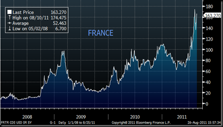
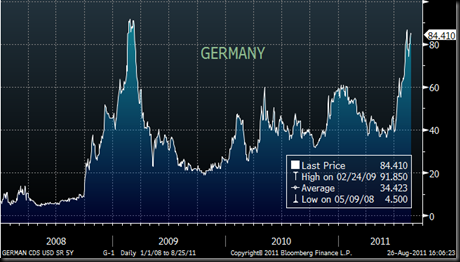
Contrast the situation in many Euro countries like France and (in particular) Spain, where levels are much higher than they were at the height of the GFC. Even the mighty German economy is virtually back to the levels seen back then.

image

image

image

Tuesday, August 16, 2011

DIX Index in overdrive

The DIX Index, which measures the standard deviation of interest rate forecasts amongst the tipsters we follow, has risen above 2 for only the second time.

imageThe last time was in October 2008 when it reached a stellar 2.6.  That month saw the second (of what would ultimately be 5) RBA cut, with the cash rate reaching 6%, down from its cyclical high-point of 7.25%.  Forecasts for the cash rate setting as at December ‘08 ranged from a steady 6% to a dramatic fall to 4.5%.  Of course the reality was that rates in December went even lower, to 4.25%.  The forecasts for March, June and September ‘09 reflected the same story, with forecasts ranging from a flat 6% (in one case, a hike to 7%) to further cuts to 4%.  The reality was that rates fell to 3.25% by March 2009, and to 3% by June.

Which was the forecaster that came so much closer to reality than the rest of them?  It was the cash rate forecasts implicit in bill futures pricing.  And guess what the situation is today, with one forecaster tipping that rates will plunge to a recession-evoking 3.25%, while the rest (bar one or two) are essentially calling for rate hikes?  Yes, its the bill futures again, although it’s significant that one of the better tipsters over a long period of time has been Bill Evans of Westpac, and he broke ranks some weeks ago with an aggressive call for four rate cuts over the next year.  None of the economists we track has followed him, although ANZ has canned its previous forecast of one or two rate hikes in favour of a flat forecast.

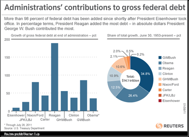
US debt – where did the $14 trillion come from?

Amidst all the angst about the size of the US deficit, I thought this graph showing where all that debt came from was fascinating:

 image

So much for fiscal conservatism!

Monday, August 15, 2011

CBA arrears – a minor uptick?

CBA’s profit announcement last week was impressive in many ways.  The data pack that went with the announcement was also impressive (see here), with a ton of data on CBA’s business.  However, one of the less impressive features was this graph:

image If you look closely, you’ll see that 90 day arrears have risen by something like 60% over the last two years…a modest uptick indeed!

Wednesday, August 10, 2011

Too good to fail?

Financial services marketing types are often keen to use climbing related imagery to promote their wares, generally with laughable results.  Check here for some prime examples.  Consequently when The Economist Intelligence Unit used a climbing theme for a recent report I subjected it to close analysis to see what flaws lay therein:

whitepaper

Surprisingly it all looks pretty good – the quick draw and chalk bag are hanging at the right angle and it’s clearly a climber doing the climbing and not some air headed model.  Just one thing…no helmet?  On the cover of a risk management paper?  I realise it’s a sport climb, where helmets are considered very naff (as opposed to trad climbing where they are only partially naff), but even so, risk management?  It’s also worth noting that he only has one quick draw left on his harness – he’s either very near the top or he’s looking at the mother of all run-outs.

Wall St. forecasters and Romanian witches

Given the Weatherman’s focus on the accuracy (or otherwise) of Australia’s economic forecaster, it was interesting to hear the Freakonomics podcast on Wall St. forecasters, crop forecasts and Romanian witches.

Check it here.

image

Tuesday, August 2, 2011

Gotti’s Plot-free Zone

Another extraordinary spray from Gotti in today’s Business Hysteria.  Try foaming at the mouth while reading this to give it it’s full effect:

Will garbage statistics throw rates reason?

Robert Gottliebsen

Published 7:15 AM, 2 Aug 2011 Last update 10:20 AM, 2 Aug 2011


Do not do it. Do not do it. This is my message to the board of the Reserve Bank as they meet later today to consider whether to lift interest rates. There are a series of dodgy figures which the zealots at the Reserve Bank will see as a call to interest rate action. The board must look beneath those figures into the real world. And, believe me, there is little joy out there in non-mining Australia.
But there is a good chance the zealots will win at today’s Reserve Bank board meeting and interest rates will rise. If they do, then the board of the Reserve Bank needs to understand that they are putting the job of governor Glenn Stevens on the line. If an interest rate hike catapults the non-mining Australian economy into a deep downturn – as I expect it will – then the governor would have to offer the government his resignation.

Damn those zealots!

It’s intriguing that every time the RBA looks to hike rates someone has to pin the blame squarely on the RBA Governor.  Who can forget this priceless font page from the Daily Telegraph back in April 2008:


I doubt we’ll ever see another shot of Pup and Lara arm in arm, but I suspect we’ll continue to see the RBA Governor slagged every time the commentariat feels we’ve gone a rate hike too far.

It’s intriguing how little credibility Stevens gets for his role in helping to steer the country through the GFC so effectively.  At least he’s now paid well to cop the abuse.

Wednesday, June 29, 2011

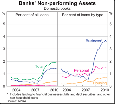
What constitutes “non-performing”?

The latest (March 2011) RBA Financial Stability Review includes the following chart showing default rates amongst different classes of bank assets:

image

This was discussed in some detail over at Business Spectator.

I’d be very interested to get a better handle on what constitutes “non-performing”.  The Housing data used here obviously reflects 90 day arrears – its broadly consistent with the 90 day numbers reported by Fitch, S&P and Westpac.  However, I’m not sure what the Business and Personal default rates reflect – my suspicion is that they are simply a reflection of absolute actual default levels, irrespective of the term or severity of the defaults.  If this in fact the case, I’d have a few issues with the analysis:

  • I don’t really understand why 90 day home loan arrears are treated as non-performing but 30 days aren’t.  A loan that’s 30 days overdue can hardly be called “performing”, given that they’ve probably missed two fortnightly payments by that stage
  • Bear in mind that almost all Australian banks measure their home loan arrears on a “scheduled balance” basis, not a “missed repayments”.  This means that the arrears balance is only 30 days overdue if the current balance exceeds what the balance should have been (if all payments had been met) by the amount of a month’s payments.  If the borrowers had been making extra voluntary payments when the going was good (and huge numbers of people do), they could go for months without making a payment before their current loan balance exceeds the scheduled balance.  On the other hand, if the “missed repayments” method is used, the earlier voluntary payments don’t count and the 30 day arrears position is reached as soon as a month’s worth of repayments are missed.

S&P’s regular RMBS Performance Watch documents these different approaches to default measurement.  I’m assuming that the RBA/APRA data reflects the same approach as the S&P data, although I couldn’t find anything to verify if that’s the case.  If it is in fact the case, the “housing” line in the graph above could conceivable be well above 2%, if 30 day arrears and missed repayments were used.

Thursday, June 23, 2011

ASX Debut at #1

It’s been a while since I updated the cash rate tipsters league table, and in the interim the stats I’ve been keeping on the cash rate forecasts implied in the pricing of bank bill futures have now reached the point that I can include them in the results for the last 3 years. Note that to get this data I’ve used the ASX 30 Day Interbank Cash Rate Futures Implied Yield Curve

It should be no surprise that bill futures, which represent the net of all the bets on the future direction of interest rates, should prove to be the best at predicting the cash rate, but nevertheless I’m still surprised.  Futures traders are way more focussed on where they believe the futures market is moving, rather than the underlying reasons why its moving, and the two don’t have to move in tandem.  Witness recent occasions when the futures strip implied a chance of a rate cut, when that clearly wasn’t on anyone’s mind, but the sheer weight of selling pressure (when expectations of future rate hikes suddenly got unwound following some bad data) pushed prices too low.  However, the stats don’t lie (these ones don’t at any rate).

Here’s the ladder for the last three years:

image


And since August 2001:

image

Monday, May 30, 2011

Accountants going backwards

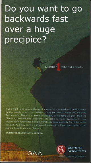
It’s always good fun when financial services people attempt to use “inspirational” climbing-themed photography to promote their wares.  This one from the Chartered Accountants in today’s AFR caught my eye:

Accountants


In view of the fact that this bloke is clearly abseiling, wouldn’t this be more appropriate?

Accountants2

As for the last line of their text, “If you want to rise to the highest heights, choose Chartered”, you might want to consider choosing someone that can tell up from down.

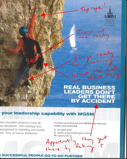
Mind you, as good as this one is, it still doesn’t get close to the head-scratching wierdness of the Macquarie Graduate School of Management previous attempt at a similar theme:

Climbing Macquarie

Tuesday, May 17, 2011

Gotti’s Irony

GottiInteresting piece in today’s Business Spectator (aka BS), which sees Gotti foaming at the mouth about “Dutch Disease” and the demise of the manufacturing sector, the banks, tourism, education and pretty much anyone with a job, as the rocketing $A and a contraction in business lending puts the skids under the non-resource sectors.  All of which begs the question as to whether we as a nation are extracting sufficient value from our once in forever boom in the demand for and price of our resources, given the collateral damage that it’s obviously causing.

However, it seems like only yesterday that Gotti was leading the charge of the anti-RSPT cadre, bellowing to all and sundry about the evils of the government’s attempts to claw back more of the minerals wealth:

“When new Prime Minster Julia Gillard announces a completely revamped mining tax it will be an enormous victory for the nation”, he wrote back in July 2010 (see “An RSPT Victory”), and went on to boast that

Here at Business Spectator, Alan Kohler, Stephen Bartholomeusz and myself realised that Rudd and Swan had made a diabolical mistake soon after it was announced. We decided to highlight every aspect of this terrible measure until it was changed. In all the KGB wrote some 80 commentaries on the tax and I think that, with a few print journalists, including Matthew Stevens on The Australian and Terry McCann on the Herald Sun, we led the push for the government to act in the national interest. Our readership soared to 400,000 as the business community turned to Business Spectator to understand what was happening. This is the first time I have been involved in an exercise like this and I have found that electronic communication is more powerful than print.

Perhaps Gotti would now be kind enough to define “national interest”.

Tuesday, May 10, 2011

ROI on Housing…..Zilch?

Someone’s just pointed me at an article in the Federal Reserve Bank of Philadelphia Business Review of Q3 2010 which essentially put the ROI of home ownership in the States over a 35 year period at slightly less than zero. I realise “we’re different” but thought it might be worth pointing out.

http://www.philadelphiafed.org/research-and-data/publications/business-review/2010/q3/brq310_benefits-and-costs-of-homeownership.pdf

Friday, May 6, 2011

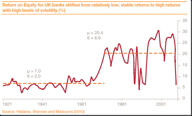
Bank ROE History Lesson

I found this graph in PwC’s latest Major Bank Analysis, which provides an analysis of – oddly enough – major banks.  What is odd is that the PwC paper deals with the 4 big Australian banks, but the graph covers UK banks – a shame someone couldn’t do the same analysis for our lot, but presumably it would look similar, shifted a few years to reflect the later introduction of financial deregulation, and also missing the catastrophic GFC related plunge at the end.


image

Monday, April 4, 2011

Yoda on Dodd-Frank

imagePerhaps Alan Greenspan, at the ripe old age of 85, should be excused for an occasional foraimagey into fantasy land, but his latest screed at FT.com (reproduced in the Business Spectator here) can’t pass without comment.

“Dodd-Frank may ruin us all” runs the alarmist banner headline.  It’s not really clear what he mean when he says “us”. Presumably not the millions already screwed over in the financial collapse so ably overseen by Al himself.

A central plank of Al’s criticism is that “The financial system on which Dodd-Frank is being imposed is far more complex than the lawmakers, and even most regulators, apparently contemplate.”

I’m not convinced this is true.  It’s bigger, and some of its products are quite complicated, but the basics of the market are unchanged.  Perhaps Greenspan’s failure to regulate the market properly in the lead up to the GFC was a product of this view – that the financial world is so clever nowadays that a system designed to reward people for writing loans that borrowers can’t afford to repay is somehow not a problem.  It doesn’t matter how you re-package those loans or how many times you on-sell them, the basics are quite simple, and it was all very wrong.  So wrong in fact that its simply astounding to see Greenspan continue to oppose those who take a different view from his own laissez-faire approach to financial market regulation.

My problem with Dodd-Frank is a bit different.  If the regulators failed to use the powers they had pre-GFC to put the brakes on the nonsense lending happening at that time, or the more bizarre bank funding mechanisms that were used in some places (e.g. Northern Rock), what use are more regulatory powers?  The missing element seems to me to be the willingness to use the powers the regulators have,  not the extent of those powers.  Remember Sarbanes-Oxley?  Fat lot of good that did!

Monday, March 28, 2011

Freddie and Fannie – where are they now?

image This “causes of the GFC” article is well worth reading, dealing as it does with  the rarely discussed but hugely significant failure of the two big US GSE home lenders, Fannie Mae and Freddie Mac.

I’m not sure I agree with all of the sentiments – particularly the suggestion that the failure of imageUS regulators to control their own lenders somehow reduces the culpability of the private sector to do the same thing – but the focus on the role played by Fannie and Freddie is appropriate given their almost unbelievable size.

Business Spectator article, originally appearing in Online Opinion.

Tuesday, March 15, 2011

The Great House Price Debate

The Great House Price Debate

The Governor of the RBA gave an interesting speech in London recently (“The State of Things”, 9/2/11). In addition to scoring some points in terms of how the economic recovery in the Asia Pacific region is proceeding compared to that in Europe and North America, he also used the question and answer session after his speech to mount a strong defence of the current level of house prices in Australia:

There is quite often quoted very high ratios of price to income for Australia, but I think if you get the broadest measures of country-wide prices and country-wide measure of income, the ratio is about four and half and it has not moved much either way for ten years. That is higher than it used to be but it is actually not exceptional by global standards.

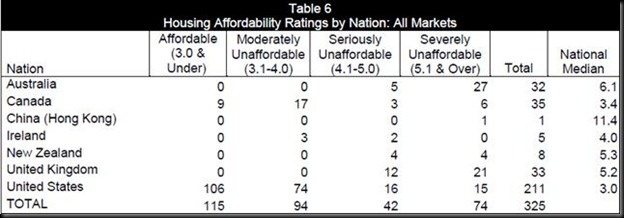
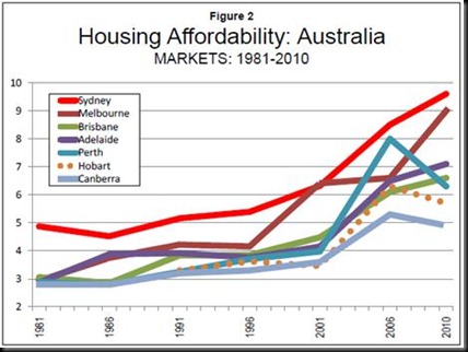
This speech was timely, given the recent piece in The Economist, which described Australian homes as the most overvalued in the world (the Economist says Australian housing is over-priced by 56 per cent) together with a Demographia report in which Australian cities again dominated the “severely unaffordable” category, with Adelaide now listed as the 8th least affordable major metropolitan centre in the seven nations surveyed (and higher on the list than both Perth and Brisbane).

Stevens’ comments immediately triggered another round in this long running debate, centred on the price versus income measure. The statement that “...it has not moved much either way for ten years” is difficult to reconcile with these graphs:
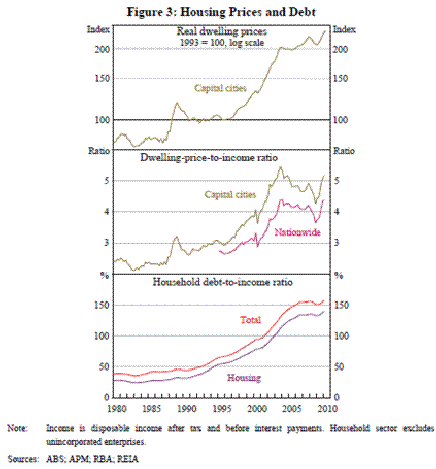
clip_image002

Even using the “average income” method it’s difficult to see how Stevens’ view can be reconciled with the data, but of more significance is the use of “average income” in the first place. This method, which has been used for some time in the Rismark/RP Data property price analyses, provides substantially different outcomes from a “median income” analysis used by other commentators, owing to the extent to which small numbers of very high income earners skew the average income figures. Average income data (as sourced through the ABS national accounts) also has potential issues with imputed rents and superannuation contributions, neither of which are of much use in the context of mortgage debt servicing.

In its recent report Demographia makes the point that:

This inappropriate practice [the use of average income] portrays Australian housing affordability as considerably more favourable than the reality, because average household incomes are materially higher than median household incomes. Average/median multiples and Median Multiples are not comparable.

Using Demographia’s methodology the picture is far less attractive:
clip_image004

On a city by city basis their data is as follows:
clip_image006

Same market, two very different stories.  Who to believe?

Search the Weatherman